Brand guidelines and press kit.
The official PropExecutor logo, mark and social images, with the colours, type and rules that keep them recognisable. For partners, press and anyone writing about us.
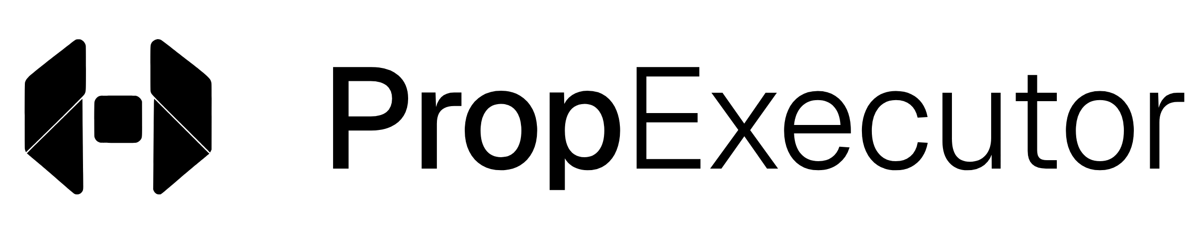
The mark and the wordmark, together.
Use the full logo wherever there is room. Black on light backgrounds, white on dark. Never place it on a colour.
Keep clear space equal to half the mark’s height on every side. Don’t set the mark smaller than 20px tall on screen.




PropExecutor. One word.
Write the name as one word with a capital P and a capital E. In the logo, the break is carried by weight alone: Prop in Medium, Executor in Light.
Black, white and a grey ramp.
The brand is monochrome. Colour is kept for data, never for buttons, links, borders or headings: green for a gain, red for a loss, amber for something pending.
Select a value to copy it.
Light ramp
Dark ramp
Data only
Geist and Geist Mono.
Geist for everything people read; Geist Mono, in tracked capitals, for labels and readings off an instrument. Both are free under the SIL Open Font License, from vercel.com/font.
Run the desk. Accounts, rules, payouts.
Headings are set tight, with negative tracking. Emphasis is weight, not colour: Medium against Light on the same line.
Equity · $1,000 account · Max loss 6%
10000412 · 14:32:07 UTC · 1,025.28
What to avoid.
The mark only works when it looks the same everywhere. Use the files above as they are.


Writing about us?
For press questions, interviews or anything the kit doesn’t cover, write to us and a person will reply.
Profile pictures and covers.
Ready-sized images for every profile. The mark sits well inside the profile picture so it survives a round crop; the covers keep the logo centred, clear of where each platform places your profile picture.
Tag us @propexecutor.
Profile pictures · 1080 × 1080
Covers and banners
Official profiles